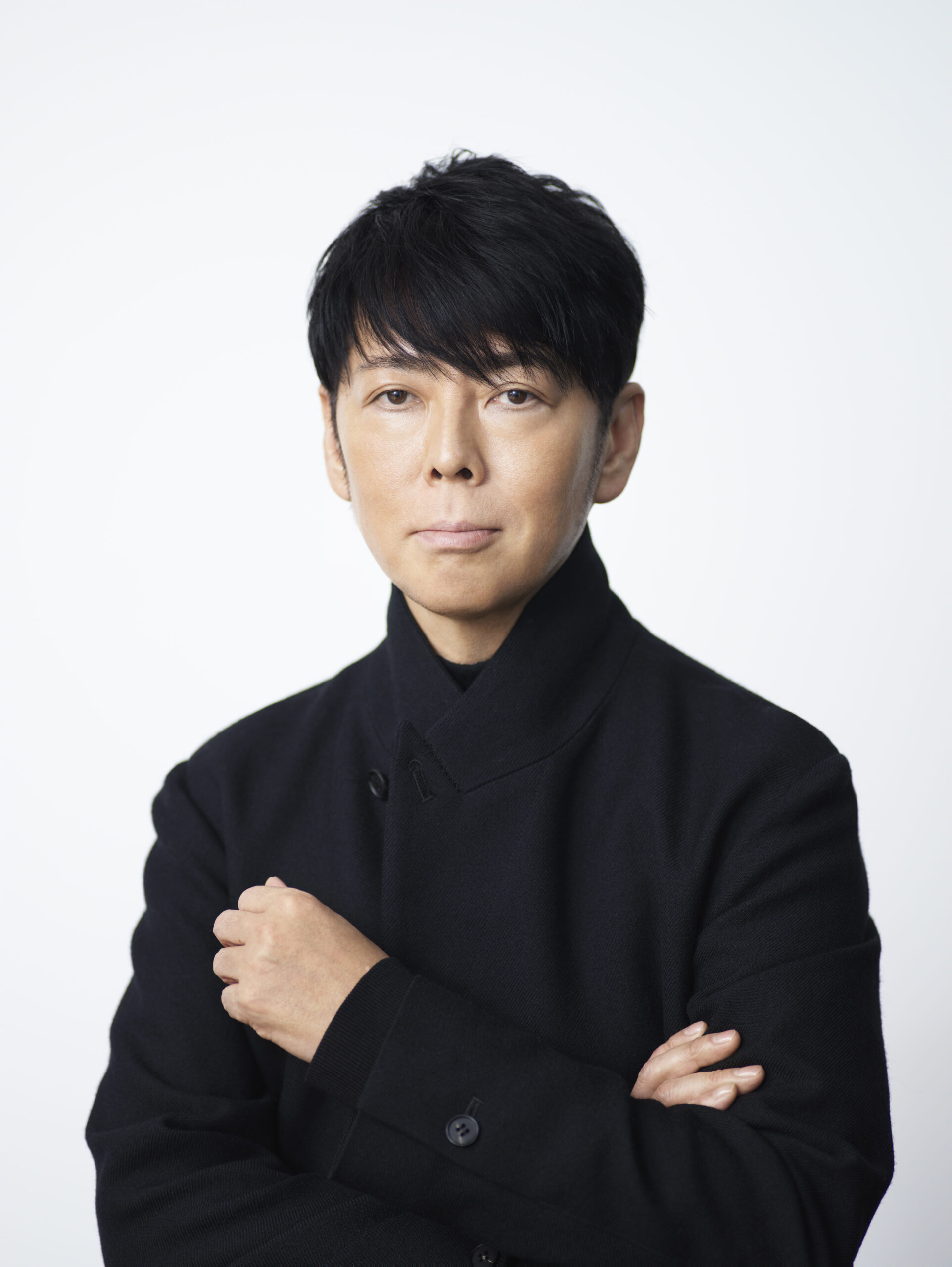
Omusubi is a traditional Japanese household food. The past decade (and counting) has seen Hyakunousha introducing Omusubi culture to Hong Kong, making it an integral part of their everyday life and synonymous with convenient, hygienic and healthy food. To take the Omusubi culture to the world and further contribute to global agriculture, Hyakunousha collaborates with renowned creative director Mr. Kashiwa Sato, who shares our vision, to launch the new brand OMUSUBI. In his role, Mr. Kashiwa Sato oversees the overall branding of OMUSUBI, and provides design and creative direction.

Mr. Kashiwa Sato oversees the branding and creative direction of the OMUSUBI brand
Hailed as a “sure-win creative director”, Mr. Kashiwa Sato previously worked at Hakuhodo Inc., Japan’s leading advertising company. In 2000, Mr. Sato established SAMURAI, his own creative design studio which was responsible for the creative direction of Uniqlo, Rakuten Group, and Seven-Eleven Japan. In 2021, the “Kashiwa Sato Exhibition” was organized at The National Art Center, Tokyo. It showcased Mr. Sato’s works which had won much acclaim over the past 30 years.
Mr. Sato is very selective about collaboration partners. When recounting the decision to collaborate with Hyakunousha, he said, “One of the management philosophies of the Omi merchants in feudal Japan is called “Sanpo-yoshi” (Triple-win). Benefits to the vendor, the customer and society at the same time. In business, it is natural for the seller and the buyer to be satisfied, but a good business should be one that contributes to society. This idea directly has become the management philosophy of Hyakunousha. As symbolized by the SDGs, there is a growing demand for companies that can respond to environmental issues, diversity, and other issues that we face through their business activities. I believe that brands having such philosophy will gain support from society and obtain success as a result. I am eager to contribute to the creation of a better society by supporting such companies with the power of creativity.” Both parties seeing eye to eye in terms of values and principles, a smooth collaboration ensued.

Simple visual elements conveying a warm message
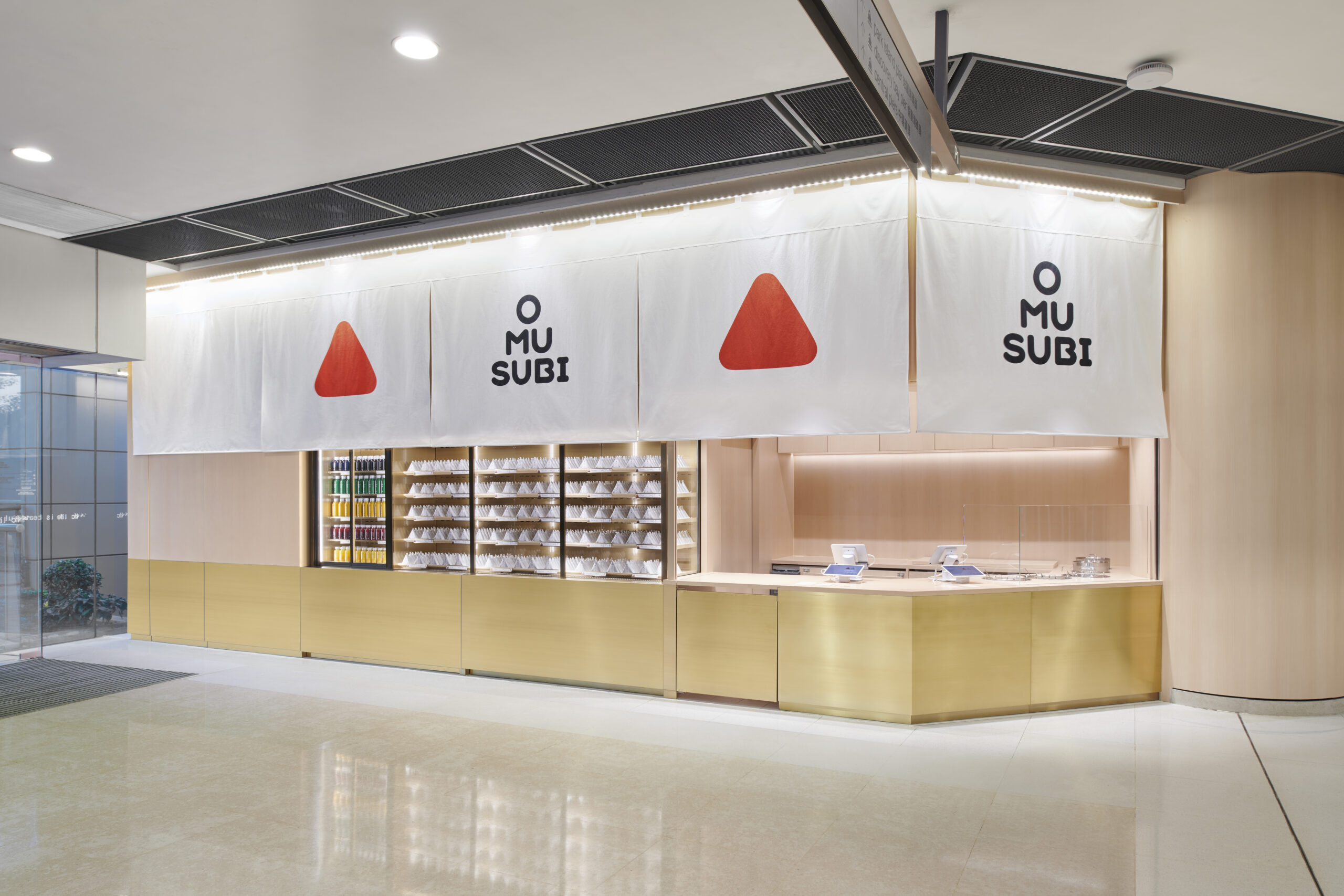
Mr. Sato is highly adept at simplifying designs. His various classic works are memorable because they use clean and direct visual elements to bring out the most iconic aspect of the brands. For the logo design of OMUSUBI, the triangular logotype allows people to instantly recognize the shape of Omusubi. The red brand colour expresses the blessing of nature from the sun, the warm heart that “Omusubi should be kind to people”, and Mr. Nishida and Hyakunousha’s strong passion. The triangular logotype of O・MU・SUBI is also a fun way for people to remember the brand name.

The theme of safety and assurance underlying the Japanese details
The store design is based on the concept of simple, warm and stylish contemporary Japanese design, using white cloth, brass and white wood as basic materials. The bold use of a pure white noren (curtain) as the brand signature gives a distinctive impact that other brands do not have. The white colour that looks like freshly cooked rice conveys a safe and assuring sense and cleanliness. The fixtures made of brass make the Omusubi look warm and inviting, while at the same time convey the dignity of the brand. It also gives the image of golden ears of rice plants. White wood, which has an antibacterial effect and has been used in Japan for centuries to make containers named “Ohitsu” to store cooked rice, is the base of the store with warmth and grace.

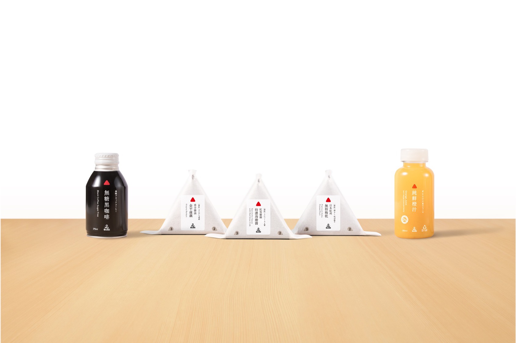
In addition, sustainable designs are adopted on our product packaging. The Omusubi packaging is partially paper; and while tea and coffee products use recyclable aluminum cans, the packaging of fresh juice uses 100% recycled plastic except for the cap. By using these materials, we have reduced plastic use at OMUSUBI, and we stride forward into the future upholding the value of sustainability.